
Whole Foods Market
Healthy Helpings,
Good to Go
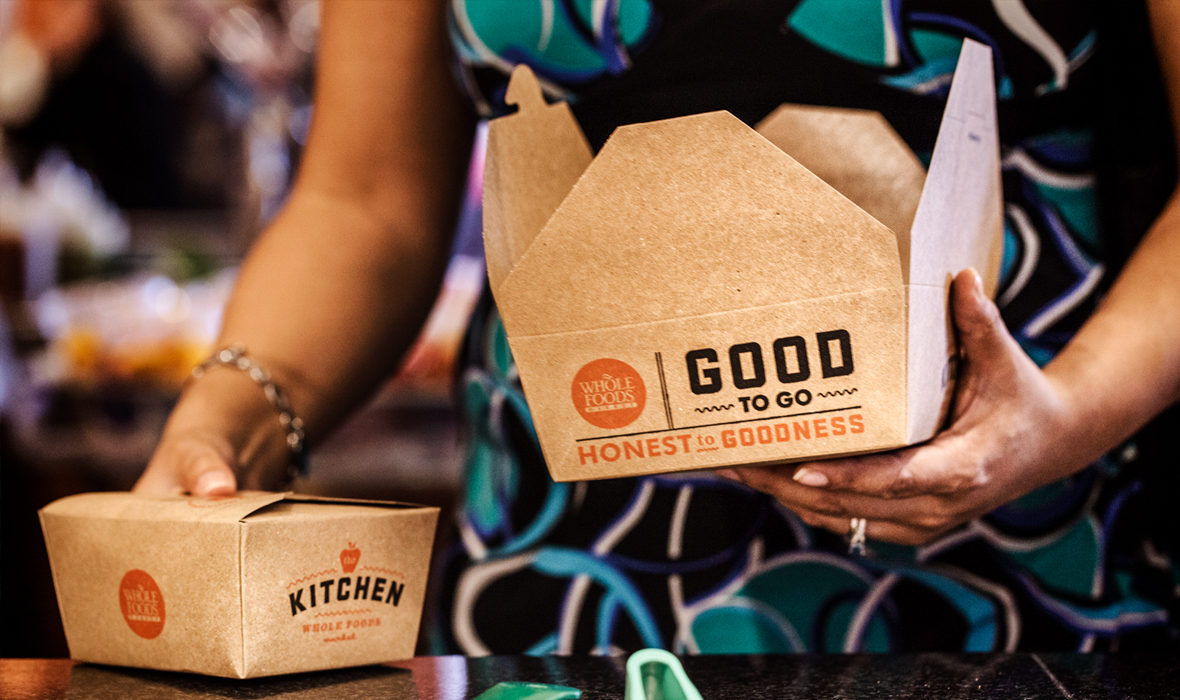
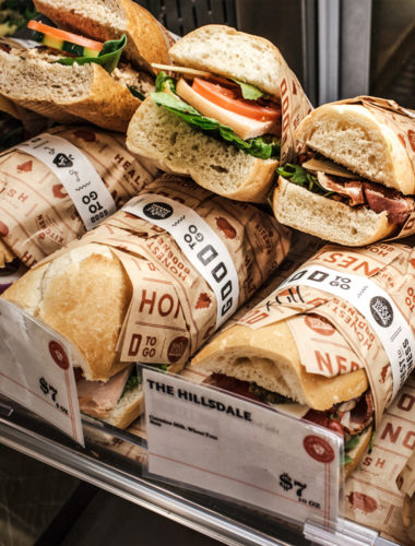
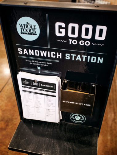
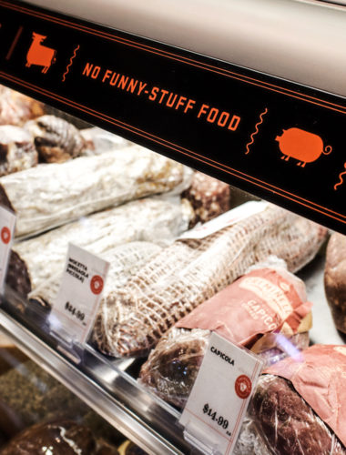
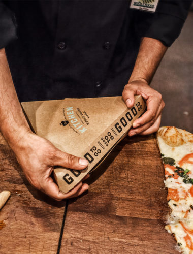
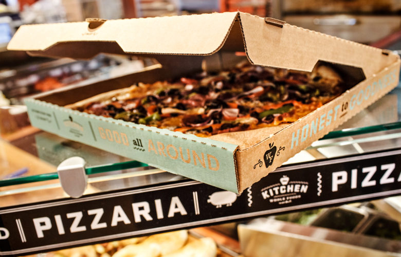
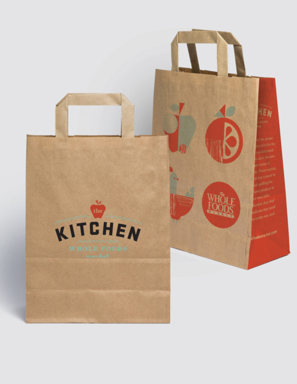
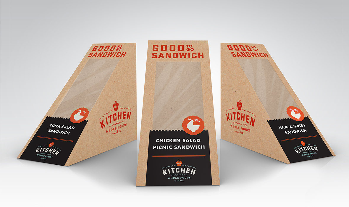
Whole Foods Market NorCal asked Rubber Design to reposition the Prepared Foods Department and implement a region-wide facelift. After several months of research and strategy, we created a campaign that visibly demonstrates their place in the market: offering a wide variety of options for healthy, quick takeout. We touched every aspect of the store experience, creating a look and voice for The Kitchen through packaging, signage, uniforms and more.
Scope
- Branding & Identity
- Strategy
- Collateral & Menus
- Packaging
- Signage
- POS Materials
The Nitty Gritty
A dramatic rise in healthy fast casual concepts was taking a hit on the Whole Foods Market Prepared Foods Department in the NorCal region (about 60 stores in California and Nevada). Well known brands like Chipotle were investing heavily in market perception, becoming staples as the go-to for quality, conscientious meals. WFM already had all the ingredients of healthy takeout—offering high-quality local ingredients, antibiotic and hormone-free meats and a focus on health, nutrition and sustainability. Every store has a trained chef running the kitchen, empowered to set seasonal, ultra local menus. They just weren’t telling this story.
WFM needed a highly visible, pervasive campaign to represent who they had always been. They needed to completely change the experience of the Prepared Foods Department for customers and to rejuvenate and energize team members to evolve and innovate the department.
Changing Perception:
From naming the department and branding it with a consumer- friendly look, we touched every aspect of the store experience. The outward facing stuff like packaging and experiential stuff like department signage and catering collateral added visibility in and out of the department. We shifted staff to casual work shirts for more casual, comfortable vibe and to visually highlight the store chefs and catering managers who kept their chef’s whites.
One of the unique qualities of WFM is the level of autonomy given to each store to create a unique, authentically local experience within the parameters of the brand. Every store has staff chalk artists and designers. We wanted to leverage this and empower them to own the campaign and grow it over time. We created a broad toolkit of materials and digital assets to set the look and maintain consistency, while letting each store morph things to their needs. WFM in-house designers loved the look and embraced it fully. One of our favorite aspects of this job has been frequenting stores, to pick up our healthy lunch, and seeing how well everything held together consistently while seeing unique applications of the elements. As important as the outward facing aspects of the project for public perception, were several recommendations on how to empower team members and shift internal perception as well. We established a set of initiatives to encourage WFM chefs to demonstrate innovative cuisine through public food events, food trucks (especially dietary focused trucks like Gluten-Free and Paleo), pop-up restaurants and creating a seasonal internal iron chef like challenge to spark creativity and friendly competition.
We completed a full test location in San Mateo, CA to launch the new look and establish a broad set of materials for leverage. Then we helped roll the new look out to roughly 40+ locations across Northern California and Nevada.
Kudos
Thanks Marketing Method for months of help with research, store interviews, planning, and strategic recommendations that created a solid foundation for the design. Thanks Brent Couchman for coming on board with us to create a stellar identity and illustration set for the campaign. Thanks Nancy Murr for the short, but really sweet copy.
ACCOLADES
Print Regional Design Annual
How International Design Awards
Brand New
The Dieline
Of Note
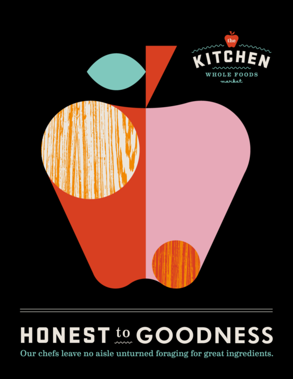
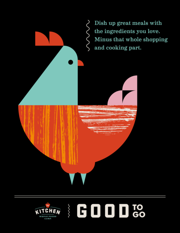
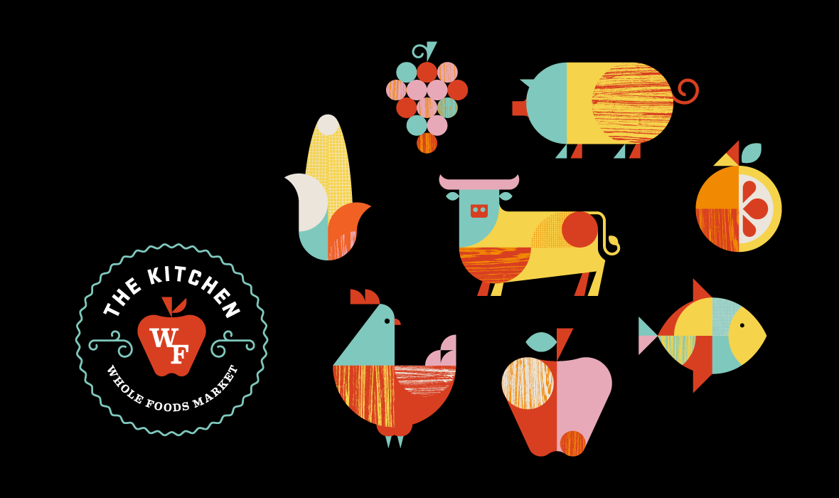
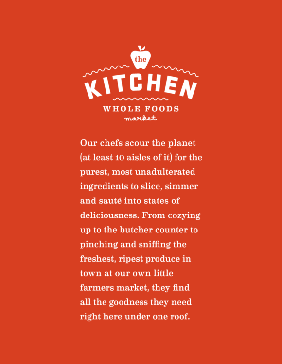
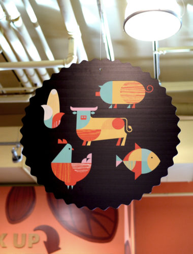
In addition to branding the Whole Foods Market Prepared Foods Department more appropriately as The Kitchen, we crafted deceptively simple language that became an important part of the campaign. Tied in with memorable illustrations from Brent Couchman, the whole campaign came to life. His playful characters and icons wove their way across the department.

The follow up
One of the most enjoyable experiences from this project came from seeing how the campaign was executed across the region. From the outset, we understood the campaign needed a high degree of flexibility. While we created a robust toolkit that gave the Whole Foods team means for maintaining consistency, they were also empowered to create authentically local interpretations at every store.
One of our best compliments was in how well received the look was by team members at the store level. They were able to find and maintain inspiration during the full course of the campaign.



More Work
-
ZeroSix
High-quality Carbon Credits That Help Move the World Closer to Net-Zero.

-
Soma Eats
Gather, Eat, Drink

-
Bean Trailer
Basecamp Refined

-
Tidal Coffee
A gathering place
for locals and
wanderers alike
-
Gus’s Holiday
Gus’s Holiday

-
Gus’s Community Market
The Friendliest Family
Grocers in the Business
-
Bacchus Management Group
At Our Table

-
Proper Food
Eat Well & Good
-
Santa Barbara Public Market
The Marketplace for local,
regional food and wine
-
Roam Artisan Burgers
Sustainable Just
Tastes Better
-
Woodlands Market
Rebranding an Historic
Bay Area Grocer
-
Yalla Mediterranean
Grilled to Order
Mediterranean Specialties
-
Besito Mexican
A Little Kiss of Mexico

-
Flour & Co
A Modern American Bakery

-
Mighty Kitchen
Small Bites,
Colossal Flavor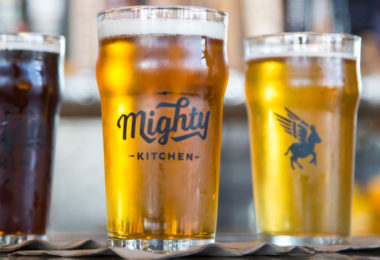
-
The Public Market
Haute Eats, Funk Couture
and plenty more ways
to feed your fancy
-
OneBar
Zero Added Sugar,
One Tasty Snack
-
Black Bark BBQ
The Original Slow Food

-
Prather Ranch Meat Co.
From Farm to Market
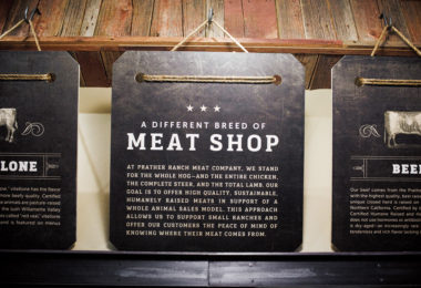
-
Wine + Beer
Shop & Tasting room
for SBPM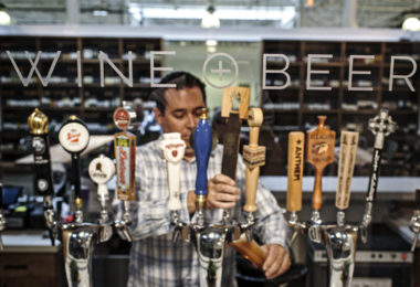
-
The Culture Counter
Raising a Stink
at SBPM
-
Foragers Pantry
Daily Provisions
at SBPM
-
Asian Box
Fresh, Sustainable,
Street Food Takeaway
-
Klein’s Deli
Recreating a Neighborhood
Institution at SFO